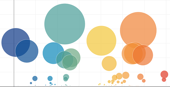
If it were up to me, I would not have chosen either of these visualizations. Pie charts are not the best way to show a relationship in data, especially when you have more than three categories. The scatter plot, while visually appealing, is not the appropriate visualization because OTU ID is a category, not a measure. I did want to include this dashboard because it demonstrates all of the skills listed in the tags below.
GitHub Repo
